[Fanart] Clair-obscur, DMBJ, Xie Yuchen/Hei Xiazi, artist freetalk
I have made a new fanart!
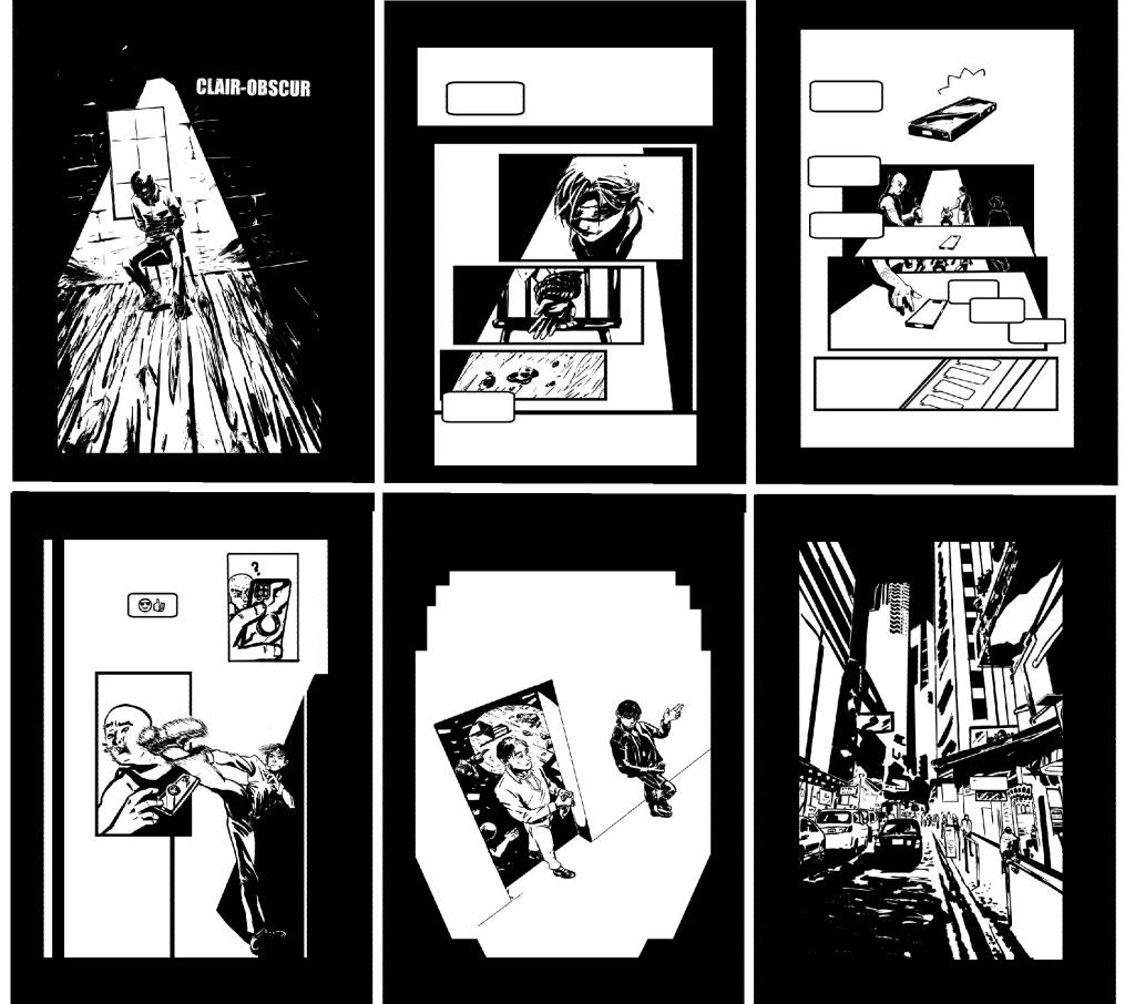
Title and link: Clair-obscur by Mo_on_raccoon
Fandom: 盗墓笔记 - 南派三叔 | The Grave Robbers' Chronicles - Xu Lei
Rating: General Audiences
Warnings: No Archive Warnings Apply
Relationships: Hei Xia Zi/Xie Yuchen
Characters: Hei Xia Zi (DMBJ Series), Xie Yuchen
Additional Tags: Fan Comics, Fanart, Kidnapping, Rescue, Action/Adventure, Texting, Digital Art
Summary:
Xie Yuchen is kidnapped. Hei Xiazi comes to the rescue... As his lift.
Work in progress, artist chatter and reference sources under the cut.
This was made for the HeiHua exchange 2025, as a gift to hollowkingspades.
After a few start and stops ideas, I settled on the concept of a comic showing a "save oneself from kidnapping".
First, know that this was started as sketches on paper.
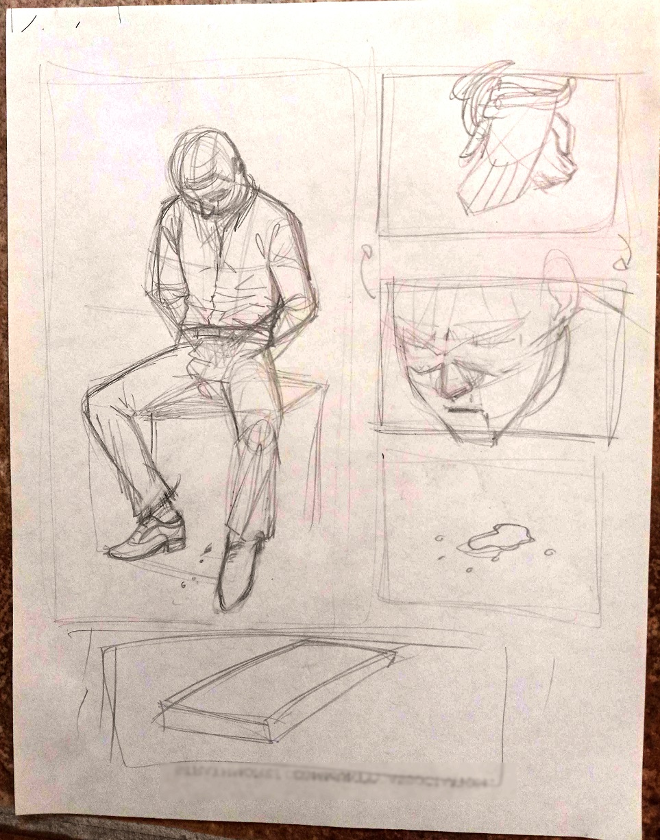
The gist of it was there, and I had a pretty clear vision of how I wanted this to land.
So off I go, sketching on my computer after putting the kids to bed. For this one I mostly used Clip Studio Paint.
During the first couple sketches, I thought it was going to be 2 or 3 pages. But then it became about 8 pages...
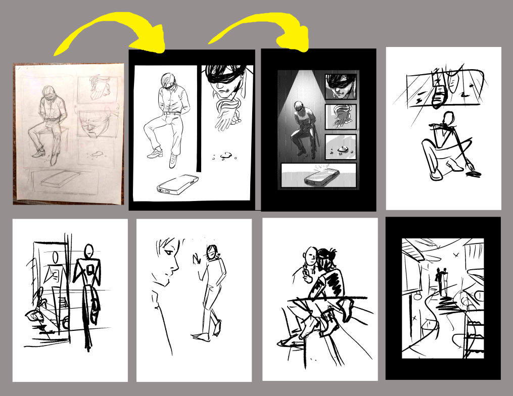
And within 2 days it became one single very looong comic strip instead. Which I have never done, but sounded like a fun exercise in flow.
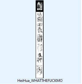
The file was renamed to this, which it would keep until the end:
(In fact, by the end it was two files because it turns out that Clip Studio has a 5000px-lenght limit to its canvas! I don't know how people who do scrolling webcomics do it.)
Once the plan is on, the next step is to convince the algorithms that I am a serial killer... I mean, amass references!
Here is what most of my references looked like.

For the 3D models, I used Posemy . art, where I modified the basic shape as well as specific ones such as Male Leaning and Male Kicking. It describes itself as "3D model poser built for artists by artists" and was fairly intuitive to use, if fiddly, and of great help with the perspectives.
I re-posed and redrew the kick/lean poses several times until it felt right, which was complicated but ultimately worth it. It felt so much more dynamic at the end!
And then, of course, one evening I decided that this wasn't Dramatic enough for the vibe I needed, and I redrew everything in much sharper contrasts.
As one does, 2 weeks before the deadline.
I was battling the greyscales, and talking about this ship with my friends, and I decided I did not want shades of greys in this, at all.
If the boys won't compromise, why would I !
I made the whole file 2 tones only, which flattened all of it. I drew over everything I already had, but with the idea that there would be no shading.
It forces one to think differently about lights and shadows, and how to convey volume via either.
Shout-out to books such as How to draw Noir comics by Shawn Martinbrough for really helping conceptualise black and white differently.
I had already decided there wouldn't be any words in this, but ALSO wanted to incorporate my giftee's prompts, who wrote they liked "Action, horror, whump enthusiast hehe and adventure. I enjoy AUs and text fics as well".
By this point I was almost done, but I kept drawing and adding or removing a few panels here and there.
Here is one panel that didn't make it:
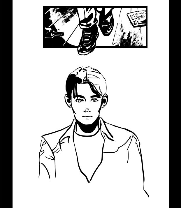
It looked good! But it wasn't adding to the story enough to stay there, and I knew I could do something more impactful even without it.
About the choice to make this one single long comic strip: in restrospect, in some ways it was liberating, not to be restricted to one page, and in other ways it made things harder to keep in motion and to keep in proportions to the rest of the comic. It was a fun and worthy experiment.
Would I do it again? Probably not, but not du to the continuous strip notion, and simply because doing 30 illustrations instead of 1, while racing multiple deadlines at once, was not a smart choice. I frequently went to bed at 2AM to draw this, and was up at 6 for kids and work.
Extremely grateful to all the people I panicked at and showed snippets of this along the way, like a baboon holding up a confused baby cub. You kept me sane and on-track when my mind spiraled in reference search and other pursuits. The HeiHua mods even granted me an extension of a couple of days to polish it, which was very kind.
All that said I am extremely proud of what I accomplished. :D It was a lot of work, and I was strong enough to start over the entire idea once, then multiple scenes until I could get them right. Younger me wouldn't have done it, and I think it those choices made the comic better.
My free time and focus are the Limited Edition type, and I won't do this kind of project again for a long time. I wanted to give it the best shot I could.
The title and text font is Dirty Headline.Thank you to Sam (lunarriviera) for helping me find a font and a title for this! It further helped the Noir Detective vibe.
The general composition of this comic is in two tones. The first is the Kidnapped scene: that overhead light shining a stark cone illuminates our "victim" Xie Yuchen and sets the mood. It repeats in all the panels of that section.
You can see it swinging slowly out of frame.
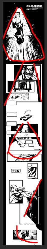
As soon as our not-so-victim sets himself free and steps *out* of the room, the composition turns to off-tilt squares (bellow, leftover red for the circle still in the room, then the straight angles start in green).
Above you can also see the rough paths I had mapped for the eye directions (middle image, in blue), and my favourite lazy trick of just going for the very classic but always sturdy composition via thirds.
The "get in the car with me" scene is the weakest because it follows these rules the least, but they were my last panels done at midnight on the extended deadline day, so. Done is better than perfect, and they convey the plot/narrative I needed them to.
Many tutorials were checked throughout the piece, but a good quick ones are the Composition and values tutorials by Irsyadalma .
For the curious, these are my folder names:
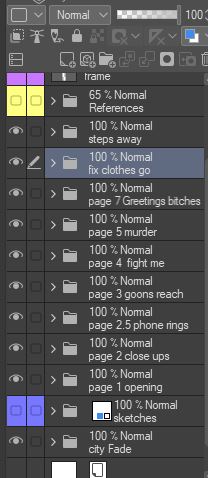
Each folder has between 10 and 20 layers, though most of those don't have names. I started with names and then kept redoing scenes so it wasn't practical anymore. I don't do Big Projects like this often, but bundling things into folders and colouring some of them really helped in the rush, and even helped me put this Behind The Scenes post together. References were in yellow, and concept lines were in red, sketches in blue.
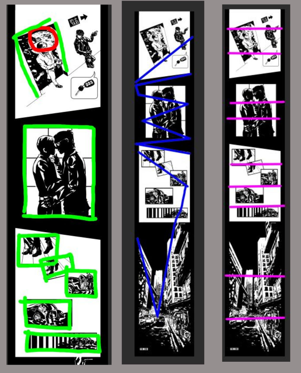
As for the texts that Hei Xiazi sends, my internal story was that he was texting domestic nonsense that served as audible time frames for Xie Yuchen.
The messages are sent faster and faster as he gets closer with the royal carriage (Xie Yuchen's lift), which I represented by having the Incoming Text bubbles physically get closer and closer on the page.
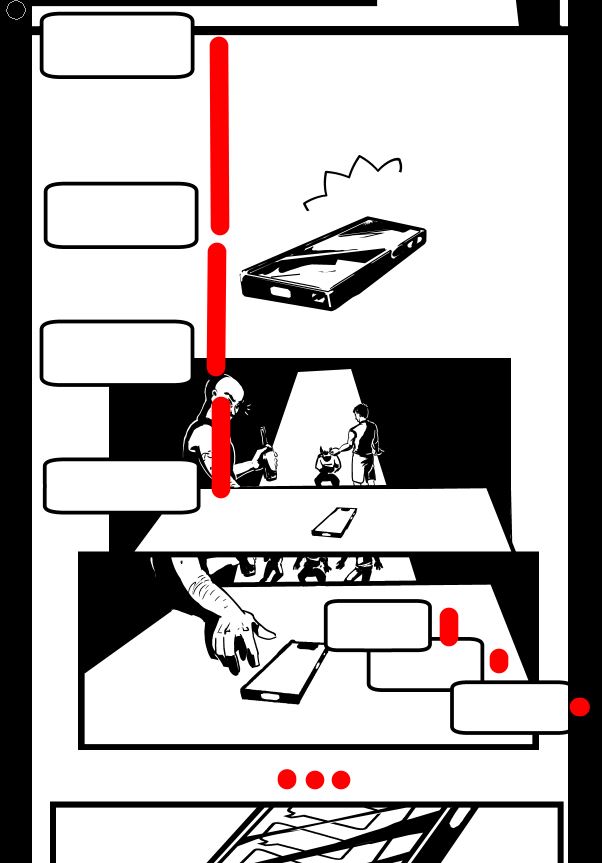
...Until it goes silent because he's parking. Which is Xie Yuchen's clue to stop pretending to be abducted and get out of there.
In my head this scene is very "Go kick ass, I got your flower".
If you have ideas of what those messages might have been, I'd love to hear them! :D
Also, note how in that tiny sliver of panels between the 4rth and 5th blips, when the goon picks up the buzzing phone, you can see the moment Xie Yuchen gets his hands loose and the other goons go "AH!!".
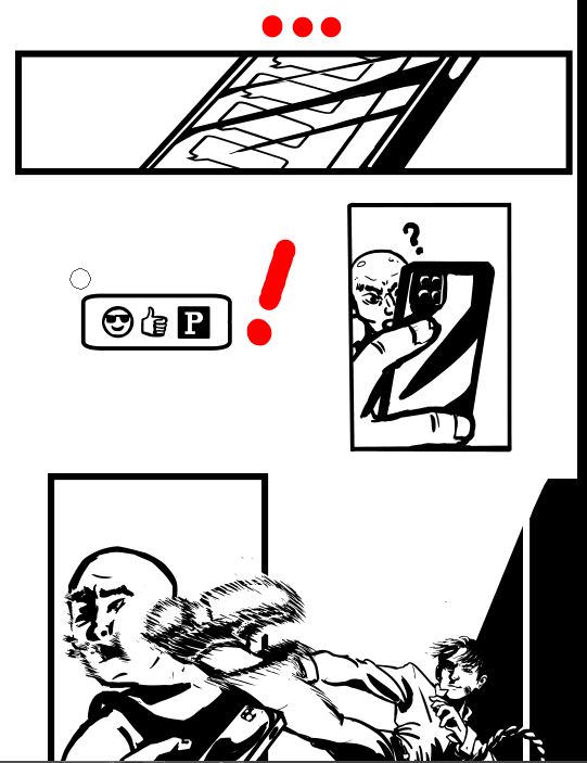
Later, Xie Yuchen can be seen with the rope still hanging around one wrist as he kicks the goon's face in, and cleaning his hands of the blood and dirt as he exits the room.
This comic in general has broad, bold strokes and a simple plot, so it was fun to do smaller details like that.
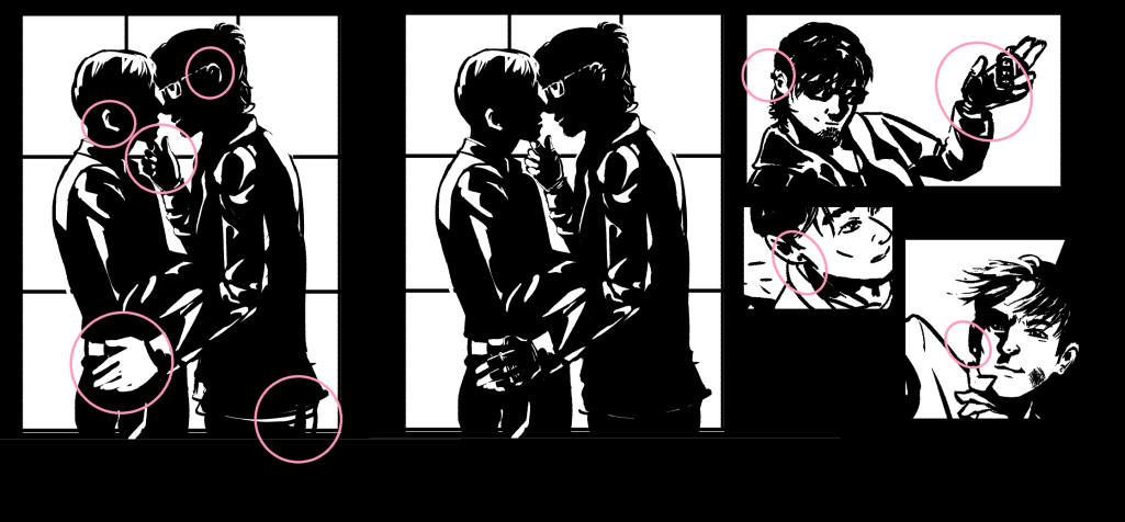
This "my fee is a kiss" panel was interesting in that I carved it from blacks. As in - I made the whole panel black, found my references and my thirds, and carved out the shapes by drawing in white.
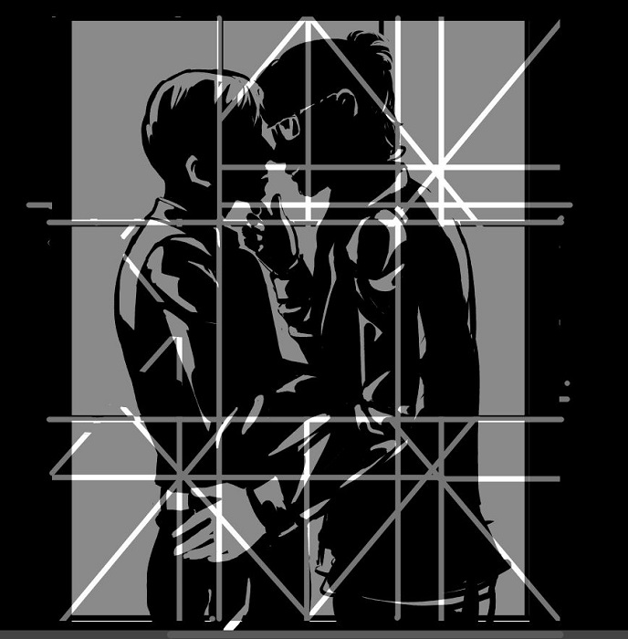
However, it became apparent that I had a problem with Hei Xiazi's hands. My artistic license is stretched through the piece, but I couldn't figure out how to do the lights on those hands and have them still distinguishable from the clothing folds.
The solution? I gave him fingerless gloves.
And earings. Because I could!
Which of course meant Xie Yuchen also should get earings. :nods nods: I imagine they are a nice pearly pink tasteful colour, while Hei Xiazi's rings are shiny oil black.
So back up I went and edited those in to other panels.
By the way, if you like this specific frame - I really do! I think it came out beautifully - you can find a Big version of it right here, for your personal use. Background, icon, carving - I'd be honoured. Have fun!
Other specific references:
(Bonus: sometimes, when searching for references, you find other artists' references, such as this one that informed this lovely HeiHua art by Kaidenchii. I like where they took it!)
I hope this post was interesting to you.
Revisiting the making of the piece from its ground up did help a lot rekindle my love for it, and appreciate the effort past me put in. There was a lot of thought and sweat poured into this, and despite the late hours it was really fun to do.
I love doing black and white work, and carving ranges of shapes in clean bold lines. While doing repetitive details and patterns make my brain go quiet and fuzzy, this made it light up with focus.
Thank you for coming along for the ride!